
Report Card Time!
As 2024 dawns, it’s appropriate to issue a climate report card on how each state is doing – which states have low carbon footprints per capita and which states are pumping out CO2 like there’s no tomorrow (which may actually turn out to be the case, if we don’t change). In the spirit of a lazy, tardy Santa Claus, I’ll look at which states are naughty, which are nice, which deserve brickbats, and which deserve kudos. This is easy – it’s the calculation of CO2 emitted per capita for each state.
As of 2020 praise and kudos go to…
| State | Rank | Metric Tons (MT) of CO2 per capita per year |
| NY | 1 | 7.1 |
| MA | 2 | 7.4 |
| CA | 3 | 7.7 |
| MD | 4 | 7.8 |
| VT | 5 | 8.4 |
Honorable mention also goes to CT, ME, NH, NJ, OR, RI, WA which all clocked in at less than 10 MT of CO2 per person per year. Small, compact, densely populated states with good public transportation do well. CA is an anomaly, but our Democratic-led aggressive approach toward the Climate Crisis has produced results. The overall US average in 2020 was 13.8 MT per capita, or just slightly less than twice the average for NY.
States with a lot of room to improve were…
| State | Rank | Metric Tons (MT) of CO2 per capita per year |
| LA | 46 | 39.4 |
| WV | 47 | 43 |
| AK | 48 | 49 |
| ND | 49 | 70 |
| WY | 50 | 96 |
The ratio of CO2 emissions of Wyoming to New York was 13.5. Of interest is that the best performing states were predominantly Democratic led while the most prolific CO2 producing states were heavy producers of fossil fuels, primarily led by Republicans.
For the results of all states, please Click.
A more difficult challenge is to compare a state’s carbon intensity over time – how a state’s GDP has changed in relation to its carbon footprint, after adjusting for population change and inflation. Which states are getting more “bang for the buck”, or more accurately, more economic activity per unit of CO2. emitted. This is also important. In grade school it’s the equivalent of receiving an “effort” grade. Sure, absolute performance is critical, but if a student, or in our case a state, is improving, this deserves recognition as well. If fractions, decimals and percents weren’t your favorite go-to subject in sixth and seventh grade, then just skip down to the comments; otherwise grab your calculator and drop into a wonderful Rabbit Hole of numbers…
Methodology*
Step 1: Divide economic activity in a base year by a state’s carbon footprint. I chose 2010 as the base year, used California data as an example, and repeated the calculation for all states. As a proxy for total greenhouse gas emitted, I used million metric tons of energy-related CO2 emitted – this is far from perfect as methane is excluded, but the data was readily available.
Step 2: Repeat, using data for year 2020. This number must be adjusted for both inflation and population change. I adjusted the 2020 GDP by increasing it by one half the increase in population between 2010 and 2020. One could argue that any increase in population would be captured as an increase in GDP, but I felt some adjustment should be made. This turned out to be a minor adjustment. A few states suffered population declines, so their GDP was decreased by half the decrease in population. Next, I divided the adjusted GDP in 2020 by inflation over the decade – 15.7%. Finally, I divided the derived GDP by the carbon footprint in 2020 to determine economic activity per unit of CO2 emitted.
Step 3: Calculate the improvement – Divide the difference by the base year.
Example: California
Step 1: 2010 Data
GDP = $2.01 Trillion.
Carbon Footprint (CF) = 356.6 million Metric Tons of CO2 emitted
GDP/CF = $5.636 Billion dollars of economic activity per Million tons of CO2 emitted.
Step 2: 2020 Data
GDP = $2.92 Trillion
Carbon Footprint = 303.8 million Metric Tons of CO2
One half of population increase = 11.9%/2 = 5.95%
Adjust GDP for population: $2.92 x 1.0595 = $3.093 Trillion
Divide by Inflation Factor (15.7%)
$3.093/1.157 = $2.674 Trillion
Divide by Carbon Footprint: 2.674/303.8 = $8.802 Billion dollars of economic activity per Million tons of CO2 emitted
Step 3: Calculate Change.
8.82 – 5.636 = 3.166
Divide by Base Year = 3.166/5.636 = 56.2% improvement.
The very good news is that most states improved their economic activity per unit of CO2 emitted over the decade 2010 to 2020, usually by a significant amount.
When it comes to improving carbon efficiency here are the standouts and the laggards.
| Rank | State | Improvement in Carbon Efficiency |
| 1 | GA | 91.3% |
| 2 | UT | 68.2 |
| 3 | TE | 66.8 |
| 4 | SC | 64.9 |
| 5 | MA | 64.8 |
| 6 | NC | 62.8 |
| 7 | AZ | 61.2 |
| 8 | KY | 60.6 |
| 9 | WA | 58.1 |
| 10 | CA | 56.2 |
| 47 | WY | -2.1 |
| 48 | CT | -3.8 |
| 49 | MS | -6.8 |
| 50 | LA | -13.0 |
| 51 | AK | -13.1 |
Comments
With the exception of MA, WA and CA, all states with the greatest improvement in carbon efficiency began from a high base of CO2 emissions – lowering their carbon intensity was relatively easy. CA, MA, and WA were standouts because they not only began as low emitters of CO2 in 2010, but also landed in the top ten when it came to improving their GDP relative to their carbon footprint.
CA was remarkable because our commutes are long, public transportation is limited, and many of us zoom between the Bay Area and the Southland by car; we have no Acela high speed train to whisk us up I-5. Yet despite these disadvantages, we emit low amounts of CO2, and we are improving.
It’s easy to view managing the Climate Crisis as impossible, but I argue that the data shows we can change, we are changing, even as we need to change more.
Please do two things:
Elect Democrats so we will improve faster!
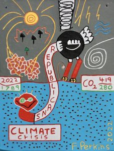 Pass this along to friends and family who have the misfortune of representation by politicians who don’t take the Climate Crisis seriously – Republicans. Yes, when it comes to climate, Republicans are ostriches with their heads in the sand of a make-believe world of 1789.
Extra credit for printing out the drawing and sending it to your least favorite Republican politician with a few pithy comments!
*If you would like to see the calculations for all the states, email me at flperkins@gmail.com and I’ll send you my spreadsheet. It would gobble up too much space for this survey article.
Leave a Reply